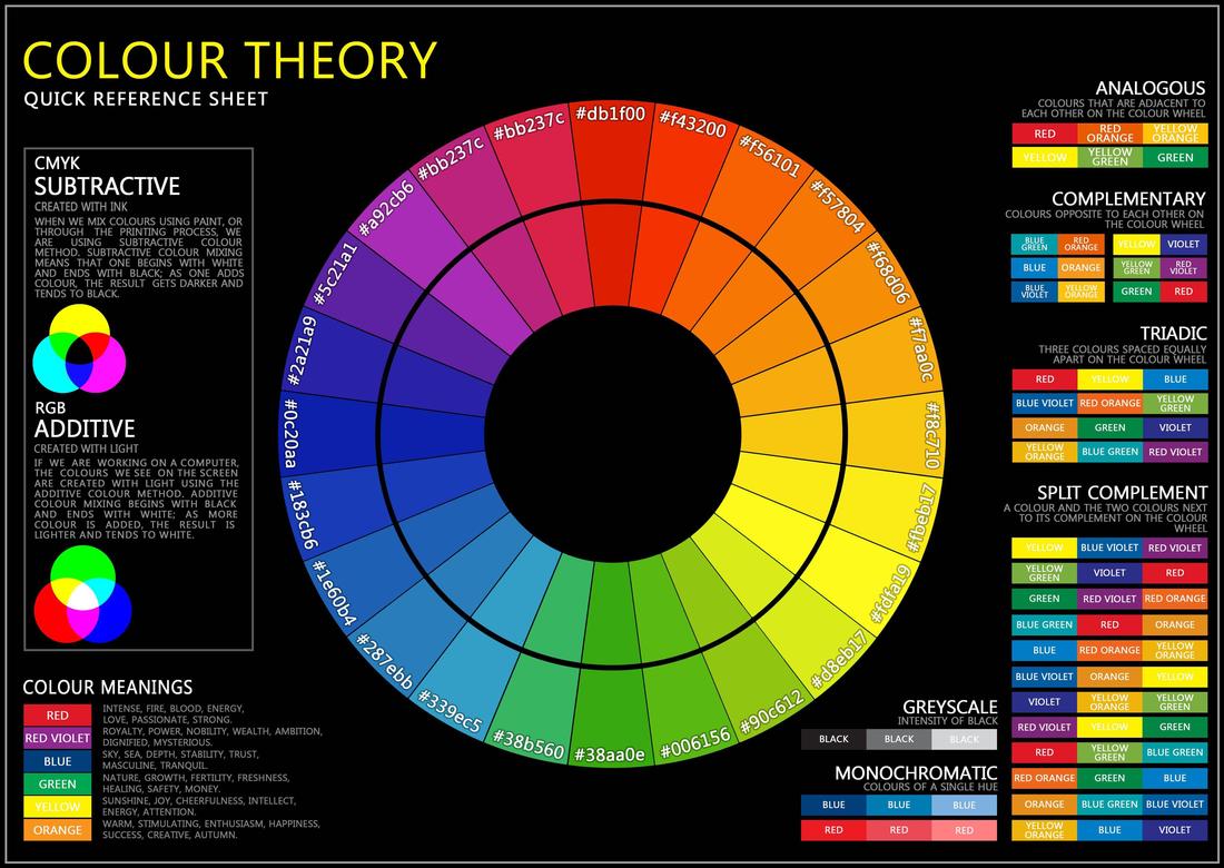
Why is colour important?
Colour is one of the most obvious and powerful tools in advertising because it can convey so much by doing so little. Different colours are able to evoke different emotions and garner different responses and this can be used to a campaigners advantage. The benefits to making people feel whatever is appropriate can be demonstrated in a variety of different ways, for instance, if an advert is for a holiday then the colours will be bright and vibrant and initiate thoughts of fun and excitement as well as reds, yellows and oranges to display warmth. In contrast, if an advert is trying to find sympathy and evoke sadness for something like Life Insurance, then the colours will appear desaturated, the colours will be used sparingly and mostly reds, blacks and greys which trigger more serious and often sinister emotions.
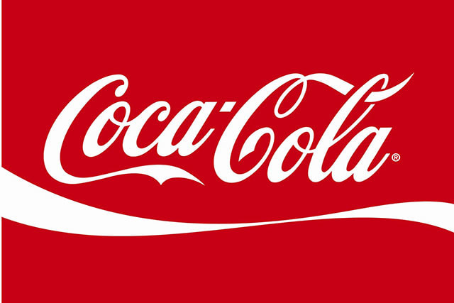
The challenge with colour is that it can mean different things to different cultures. For example, in China, the colour red is very important. It can mean luck and good-fortune, it's the primary colour of the flag, it's the colour representing their communist state and it is celebrated and respected. however, in most western cultures red stands for danger, fury and a fiery passion. It's a strong colour used in most major international brands like McDonalds, Coca-Cola, YouTube, Virgin and manY, many more.
The challenge with colour is that it can mean different things to different cultures. For example, in China, the colour red is very important. It can mean luck and good-fortune, it's the primary colour of the flag, it's the colour representing their communist state and it is celebrated and respected. however, in most western cultures red stands for danger, fury and a fiery passion. It's a strong colour used in most major international brands like McDonalds, Coca-Cola, YouTube, Virgin and manY, many more.


Case Study

For my campaign I looked to a company that not only operated in the same industry, but also had a similar style of branding so that I could deconstruct it and discover the reasons behind the same colours being used for Dragonz Lair.
The Primary Colour is Red which stands bold and staunch in front of a plain black background. This creates immediate senses of dark, seriousness and is quite sinister and masculine. It is also predominantly the colour of blood, something often associated with Mixed Martial-Arts, often known as 'Cage-Fighting'. The colour red is very emotionally intense and when you see it so predominantly placed against the black background it immediately receives an emotional response. It looks to be taken seriously, enhanced by the sharp font.
The Primary Colour is Red which stands bold and staunch in front of a plain black background. This creates immediate senses of dark, seriousness and is quite sinister and masculine. It is also predominantly the colour of blood, something often associated with Mixed Martial-Arts, often known as 'Cage-Fighting'. The colour red is very emotionally intense and when you see it so predominantly placed against the black background it immediately receives an emotional response. It looks to be taken seriously, enhanced by the sharp font.
Colour Theory in my Campaign
When looking at the Dragonz Lair branding, I noticed a lot of the same motifs that appeared in my case study. Firstly, the bold and strong use of red against a black background. This shows a clear correlation to the themes that UFC were conveying in that it is masculine, it reminds you of blood and it creates that immediate and intense emotional response.
A key difference is the introduction of white to the text. The white not only breaks up the text as a whole, but it also welcomes a plethora of new connotations. White symbolises something clinical and pure as well as make you think of a beginning. A blank page is white, something filled with potential for anything, and therefore white makes you think about potential for success, to start something new. The idea of conveying this alongside the colours of red and black is a strong representation both the sport and the fact that it is a gym offering potential to change.
A key difference is the introduction of white to the text. The white not only breaks up the text as a whole, but it also welcomes a plethora of new connotations. White symbolises something clinical and pure as well as make you think of a beginning. A blank page is white, something filled with potential for anything, and therefore white makes you think about potential for success, to start something new. The idea of conveying this alongside the colours of red and black is a strong representation both the sport and the fact that it is a gym offering potential to change.
